UIBarButtonItem & iOS 11
Overview
iOS 11 and Xcode 9 have officially been out for just over a month now and one interesting area that had some changes is the behaviour of UIBarButtonItems within UINavigationBar.
Here are my findings so far …
Changes
In summary the highlights are:
- Tap areas of custom view
UIBarButtonItems are now smaller - The back button’s tap area is also smaller
- The back button label no longer automatically updates if the previous screen title changes
- Custom views need to be auto layout friendly
- Negative fixed space items no longer work and now have a minimum width of 8 points
- Overriding
alignmentRectInsetsmay cause custom views to fall outside the tap region
The following sections will dive into the details of those points.
Tap Areas
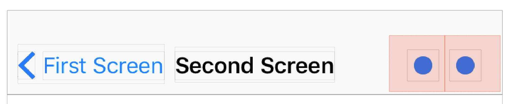
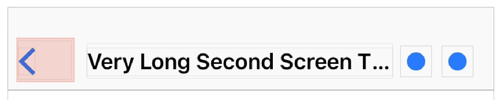
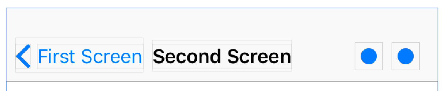
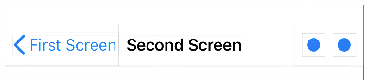
Take for example the screen below from iOS 10 with two UIBarButtonItems with custom views. Inspecting the screen in the view debugger reveals the custom views’ true size.
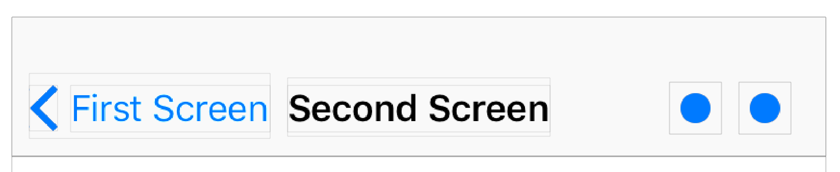
Their tap area is actually much larger, and is approximated by the overlaid red boxes:
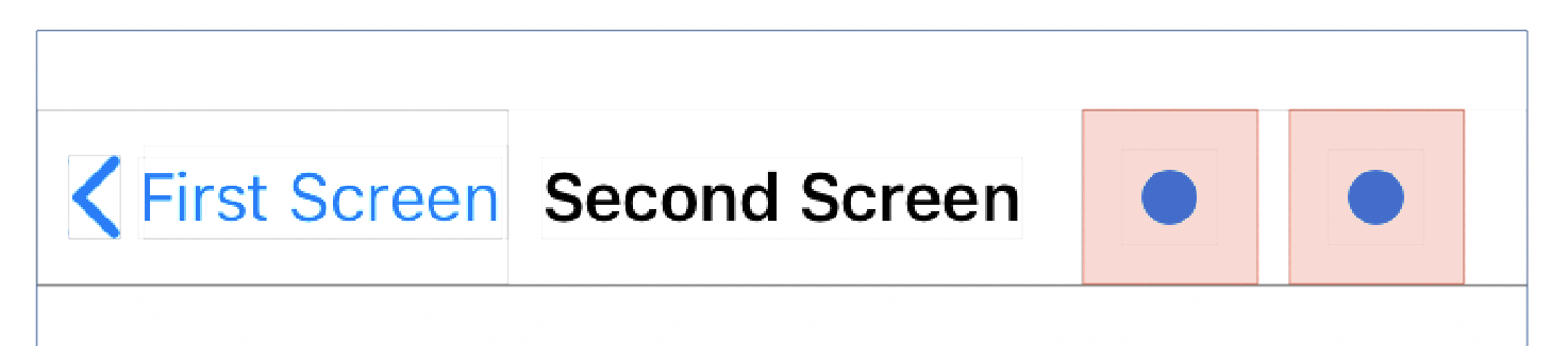
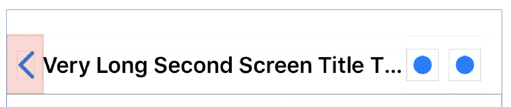
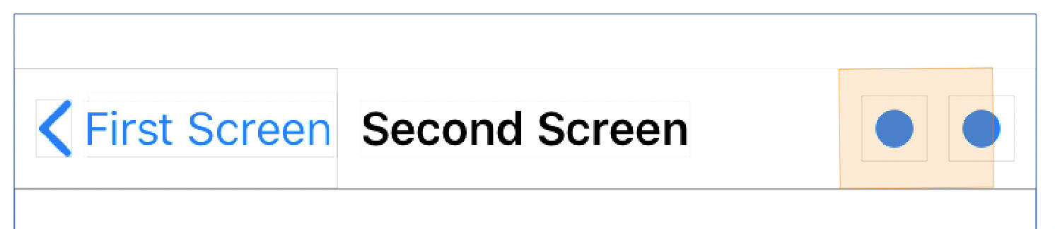
On iOS 11 however, this behaviour has changed. The tap area now matches the custom view size!
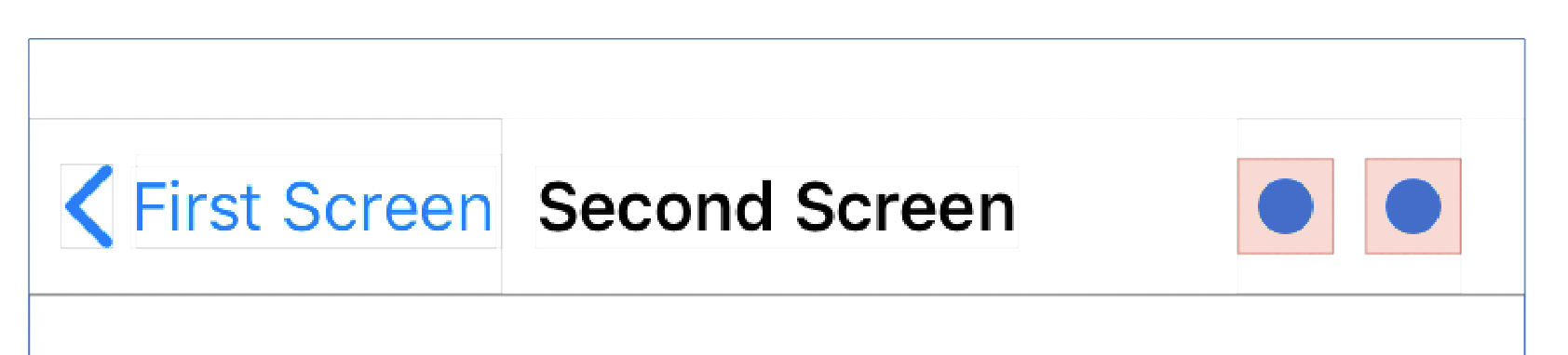
This does hinder usability somewhat as users will find those buttons harder to tap. To restore the larger tap areas, the custom views now need to be sized with extra padding. An alternate solution is to create a wrapper view that has a minimum size constraint.
class WrapperView: UIView {
    let minimumSize: CGSize = CGSize(width: 44.0, height: 44.0)
    let underlyingView: UIView
    init(underlyingView: UIView) {
        self.underlyingView = underlyingView
        super.init(frame: underlyingView.bounds)

        underlyingView.translatesAutoresizingMaskIntoConstraints = false
        addSubview(underlyingView)

        NSLayoutConstraint.activate([
            underlyingView.leadingAnchor.constraint(equalTo: leadingAnchor),
            underlyingView.trailingAnchor.constraint(equalTo: trailingAnchor),
            underlyingView.topAnchor.constraint(equalTo: topAnchor),
            underlyingView.bottomAnchor.constraint(equalTo: bottomAnchor),
            heightAnchor.constraint(greaterThanOrEqualToConstant: minimumSize.height),
            widthAnchor.constraint(greaterThanOrEqualToConstant: minimumSize.width)
        ])
    }
    // ...
}
Not quite what iOS 10 offered alignment wise, but does restore the larger tap areas.
Back Button
Tap Area
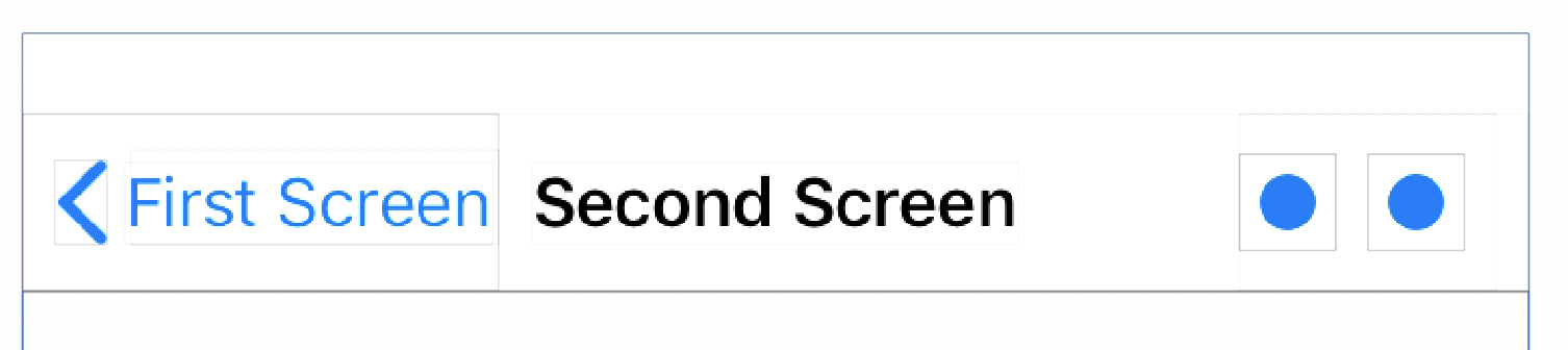
Tap areas are now also smaller on back buttons when the title is really long. For example, on iOS 10 the back button had a generous minimum size and tap area.
While on iOS 11 it has a much smaller size and tap area. What’s worse is it looks like the title of the current screen is the back button’s label.
One option to prevent this scenario from occurring is to manually set a backBarButtonItem on the previous screen.
navigationItem.backBarButtonItem = UIBarButtonItem(title: "First Screen", style: .plain, target: nil, action: nil)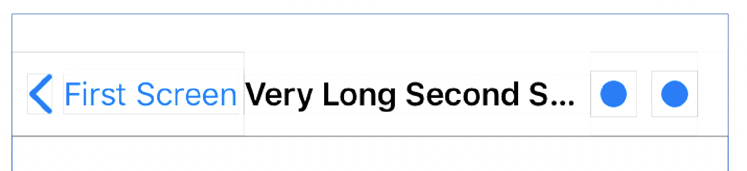
This solution isn’t ideal however for several reasons:
- If we know what the titles of all our screens are in advance, we’d need to “litter” back buttons in screen’s that come prior to them.
- If we don’t know the titles in advance, we’d need to set it everywhere.
- We’d loose out on the default back button’s rendering behaviour which adapts to the space available (see Apple Docs)
< First Screen< Back<
Update: A radar was filed (36223743).
Dynamic Label Updates
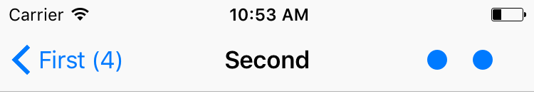
Another change in behaviour in iOS 11, is the back button label itself. For example, if the first screen had a title with a count that updates dynamically
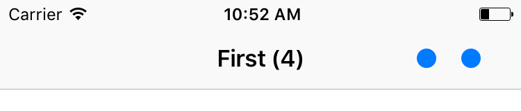
On iOS 10, if the title updates, so will the back button label
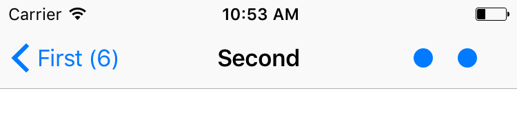
On iOS 11 however, the button label appears to be static and no longer updates automatically.
A simple fix for this issue would be to manually manage the backBarButtonItem in the first screen.
navigationItem.backBarButtonItem = UIBarButtonItem(title: "First (\(counter))", style: .plain, target: nil, action: nil)Note: A new bar button item instance is needed each time, simply updating the title on an existing instance will not work.
Update #1: A radar was filed (35119951).
Update #2: An alternate solution is to simply “toggle” the backBarButtonItem
func updateTitle() {
    title = "First (\(counter))"
    navigationItem.backBarButtonItem = UIBarButtonItem(title: title, style: .plain, target: nil, action: nil)
    navigationItem.backBarButtonItem = nil
}
This will ensure the back button retains its default rendering behaviour (described in the previous section).
Auto Layout
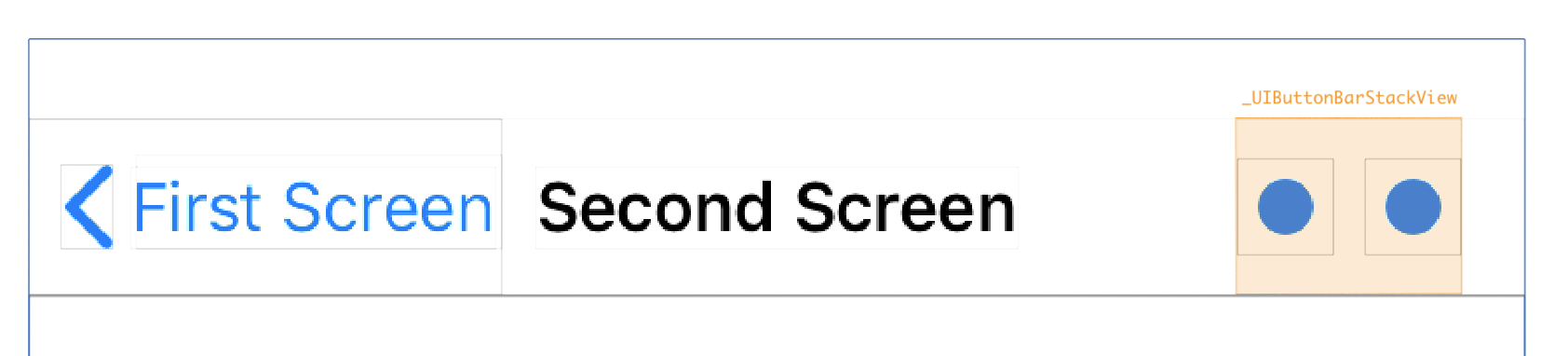
UINavigationBar now leverages auto layout internally to layout its subviews including custom views. This was actually mentioned in the Updating Your Apps for iOS 11 WWDC talk earlier this year.
Inspecting the navigation bar on iOS 11 in the view debugger reveals that the buttons are now internally managed by a stack view.
Provided custom views implement the sizeThatFits and intrinsicContentSize correctly, everything should work as before.
A word of caution however, setting translatesAutoresizingMaskIntoConstraints to false on the custom view can result in ambiguous constraints when running on iOS 10 (if you still support it). This can lead to your custom views getting misplaced in the top left corner. A simple solution here is to guard that with an iOS 11 availability runtime check.
let customView = createCustomView()
if #available(iOS 11, *) {
    customView.translatesAutoresizingMaskIntoConstraints = false
}
navigationItem.rightBarButtonItem = UIBarButtonIte(customView: customView)
Custom Alignment
For those of us who needed finer control of the alignment of their custom UIBarButtonItems especially the trailing margin to the edge of the screen. Prior to iOS 11, two “tricks” were often used:
- The first was using fixed a space item
UIBarButtonItem(barButtonSystemItem: .fixedSpace …)with a negative width - The other was to override
alignmentRectInsetson the custom view
Sadly the behaviour of both of these has changed in iOS 11
Fixed Space Items
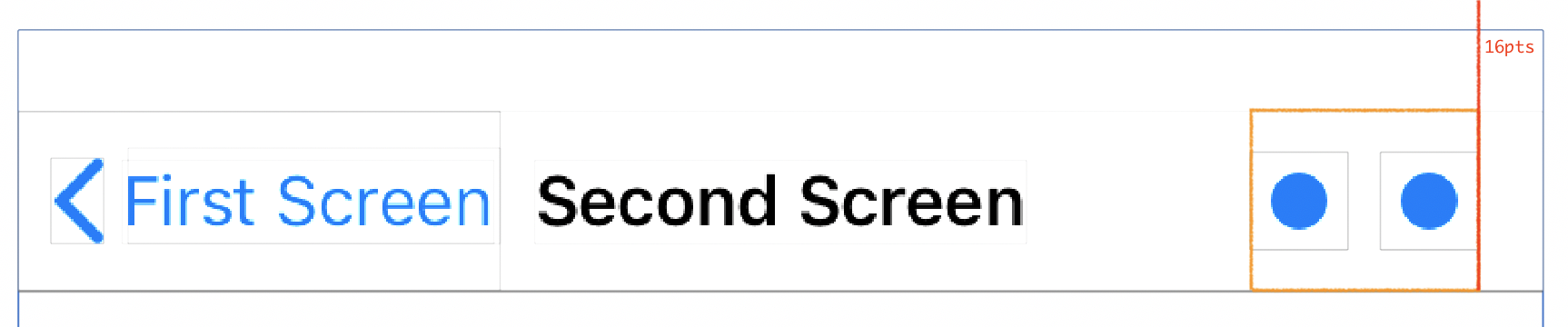
When using custom views, the default margin applied is 16 points
Suppose we wanted to reduce that to 8 points, using a fixed space UIBarButtonItem with -8 width would achieve the desired effect on iOS 10:
let spacer = UIBarButtonItem(barButtonSystemItem: .fixedSpace, target: nil, action: nil)
spacer.width = -8
let barButtonsItems = [
    spacer,
    UIBarButtonItem(customView: createCustomButton()),
    UIBarButtonItem(customView: createCustomButton())
]
navigationItem.rightBarButtonItems = barButtonItems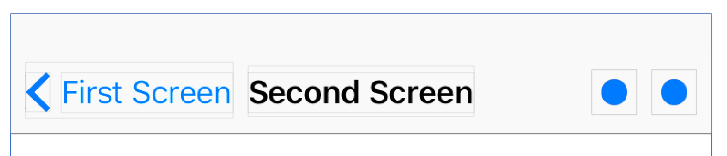
Unfortunately on iOS 11 this not longer works.
Furthermore, it appears that leading and trailing fixed space items ignore any value less than 8 points. That actually makes it consistent with the behaviour fixed space items have when used in-between items.
Alignment Rect Insets
The second trick to control button alignments was to override alignmentRectInsets.
class CustomView: UIView {
    var alignmentRectInsetsOverride: UIEdgeInsets?
    override var alignmentRectInsets: UIEdgeInsets {
        return alignmentRectInsetsOverride ?? super.alignmentRectInsets
    }
    // ...
}
Setting a value of of UIEdgeInsets(top: 0, left: -8, bottom: 0, right: 8) would achieve the desired alignment for our previous example.
This somewhat still works on iOS 11, however there is a small caveat. Upon taking a closer look, it appears that a small part of the trailing item now falls outside of the internal stack view’s bounds. That part no longer receives touches, which results in reducing the tap area of that item!
Workaround
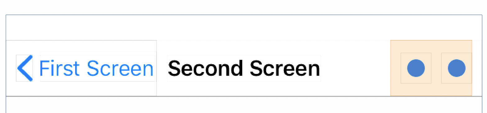
Taking a look back at our previous fixed space example on iOS 11 we discover an interesting side effect, the margin is smaller than usual:
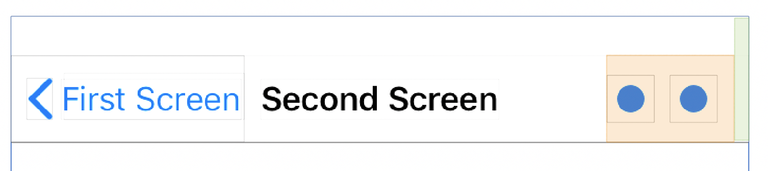
Turns out, this occurs whenever the trailing item is a non custom view UIBarButtonItem as opposed to a custom view item.
Take for example the following non custom view UIBarButtonItems, the margin from the edge of the screen is 8 points
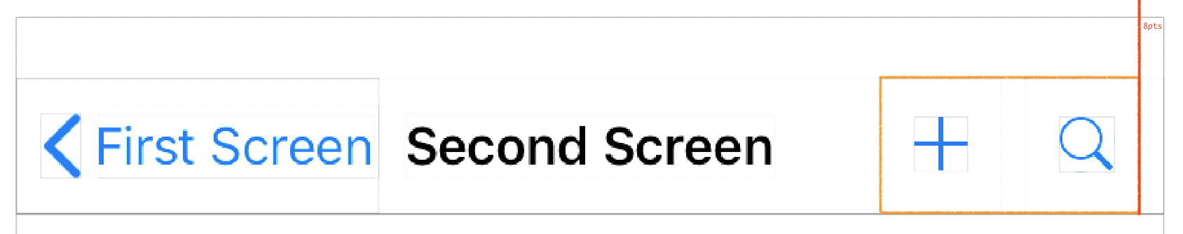
Versus when custom views are used, the margin is 16 points
Combining these observations, our goal of an 8 point margin for custom views can still be achieved on iOS 11. Adding a trailing fix space item will make the internal stack view have a reduced margin, then shifting the custom views using alignmentRectInsets by an offset equivalent to the fixed space width would align them to the trailing edge of the internal stack view.
func alignedBarButtonItems() -> [UIBarButtonItem] {
    let spacer = UIBarButtonItem(barButtonSystemItem: .fixedSpace, target: nil, action: nil)
    spacer.width = 8
    let barButtonsItems = [
        spacer,
        UIBarButtonItem(customView: createCustomButton(offset: spacer.width)),
        UIBarButtonItem(customView: createCustomButton(offset: spacer.width)),
        ]
    return barButtonsItems
}

func createCustomButton(offset: CGFloat = 0) -> UIButton {
    let button = CustomButton(frame: CGRect(x:0, y: 0, width: 24, height: 24))
    button.alignmentRectInsetsOverride = UIEdgeInsets(top: 0, left: -offset, bottom: 0, right: offset)
    button.translatesAutoresizingMaskIntoConstraints = false
    return button
}
Though quite interesting, this workaround only works up to 8 points, anything further will be outside the stack view bounds. In addition it relies on a side effect of undocumented UIKit behavior that may very well change in the future (much like the negative fixed space trick).
On the Developer Forums there are a few suggestion for other workarounds to eliminate the internal stack view margins completely - though they do require a custom UINavigationBar subclass and some medeling with it’s internals which is not ideal either.
Conclusion
Who would have thought there would be this much to write about UIBarButtonItems, but here we are. Feel free to leave a comment if you find any other issues or spot any elegant solutions!