Styling In Storyboards Using Swift
Overview
Storyboards are fantastic for creating screens fairly quickly. The final appearance of those screens however may differ greatly at runtime. This is to be somewhat expected, as many of our apps will use one or more custom UI components in addition to leveraging a distinct theme and color palette that may be defined in code.
In this post I will be sharing a technique I found that can help adopt custom styling within a Storyboard, by using IBDesignable, IBInspectable and reflection in Swift!
Sample Use Case
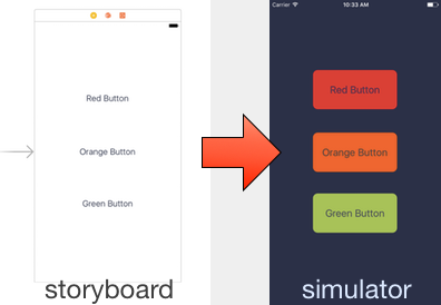
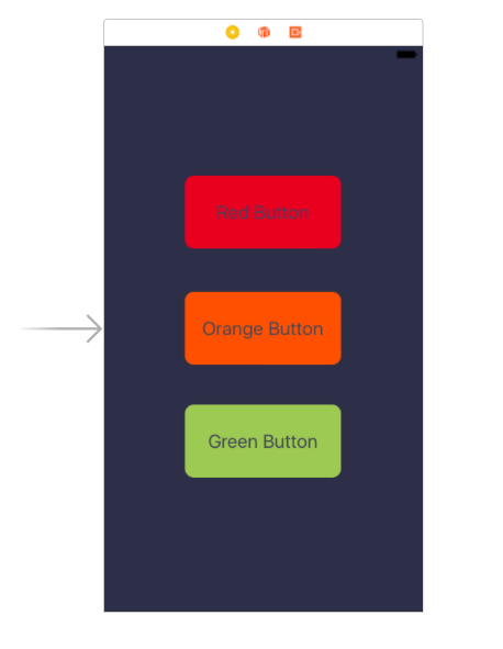
Let’s consider a sample use case. The goal is to produce the following screen:
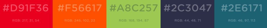
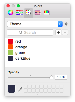
Our designers have provided us with the following color palette:
 (Palette generated by coolors.co)
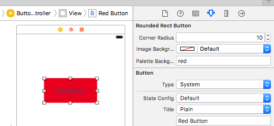
Which we can use to style our fancy UIButton subclass RoundedRectButton to achieve the desired design.
class RoundedRectButton: UIButton {

    var cornerRadius: CGFloat = 4 {
        didSet {
            updateStyle()
        }
    }

    var imageBackgroundColor: UIColor? {
        didSet {
            updateStyle()
        }
    }

    func updateStyle() {
        if let color = imageBackgroundColor {
            setBackgroundImage(SimpleImages.roundedRect(radius: cornerRadius, color: color), for: .normal)
        }
    }
}
Basic Solution
One common way to achieve this is to add three buttons in interface builder, change their class type to RoundedRectButton and connect them to IBOutlets in our view controller subclass. We can then apply our custom styling when the view loads:
class ButtonsViewController: UIViewController {

    @IBOutlet var redButton: RoundedRectButton!
    @IBOutlet var orangeButton: RoundedRectButton!
    @IBOutlet var greenButton: RoundedRectButton!

    override func viewDidLoad() {
        super.viewDidLoad()

        // Apply custom theme colors
        view.backgroundColor = Theme.palette.darkBlue

        redButton.imageBackgroundColor = Theme.palette.red
        orangeButton.imageBackgroundColor = Theme.palette.orange
        greenButton.imageBackgroundColor = Theme.palette.green
    }
}
Where we have defined our color palette as:
struct Theme {
    static let palette = Palette()
}

struct Palette {
    let red = UIColor(red: (217.0/255.0), green: (31.0/255.0), blue: (54.0/255.0), alpha: 1)
    let orange = UIColor(red: (245.0/255.0), green: (102.0/255.0), blue: (23.0/255.0), alpha: 1)
    let green = UIColor(red: (168.0/255.0), green: (194.0/255.0), blue: (87.0/255.0), alpha: 1)
    let darkBlue = UIColor(red: (44.0/255.0), green: (48.0/255.0), blue: (71.0/255.0), alpha: 1)
}
A helper method or extension on UIColor can tidy up all those inline calculations, but this will do for now.
Leveraging IBDesignable & IBInspectable
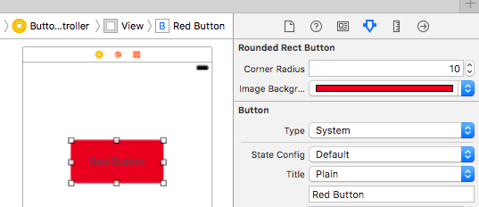
IBDesignable and IBInspectable allow custom UI components to be rendered and customized in interface builder (Nate Cook did a great write up on them here). They are exactly what we need to get our views in interface builder looking closer to final result.
@IBDesignable
class RoundedRectButton: UIButton {

    @IBInspectable var cornerRadius: CGFloat = 4 {
        didSet {
            updateStyle()
        }
    }

    @IBInspectable var imageBackgroundColor: UIColor? {
        didSet {
            updateStyle()
        }
    }

    func updateStyle() {
        if let color = imageBackgroundColor {
            setBackgroundImage(SimpleImages.roundedRect(radius: cornerRadius, color: color), for: .normal)
        }
    }
}
By making those tweaks, our buttons can now be customized and rendered directly from within interface builder!
That’s great but what about our color palette?
One option we have is replicate the palette in Xcode (see Natasha’s post).
Sadly that palette is fairly static and can’t be exposed to the code should we need to reference the colors there. Additionally, any visual overhauls that result in tweaking our master palette wouldn’t automatically be picked up by our buttons!
Exposing Our Palette
Ideally we’d like to define some enum we expose as an IBInspectable, unfortunately IBInspectable does not yet support enums.
We can however workaround this by using IBInspectable compatible values and map them to our palette. For example, we can map our colors using a String:
extension Palette {
    func color(from string: String) -> UIColor? {
        switch string {
            case "red": return red
            case "orange": return orange
            case "green": return green
            case "darkBlue": return darkBlue
            default: return nil
        }
    }
}
A new inspectable property can then be added to our button:
 @IBInspectable var paletteBackgroundColor: String? {
        didSet {
            imageBackgroundColor = paletteBackgroundColor.flatMap{ Theme.palette.color(from: $0) }
        }
    }
This achieves what we’re after! The best part is, should we ever change the palette color values, everything will automatically pick it up!
Automatically Mapping Colors
This seems reasonable given we only have four colors, but what if our palette grows to 30 colors and what if we wanted to adopt this approach for fonts and other properties too? This will certainly become unmanageable and quite error prone!
Luckily, we can make our solution more scalable using reflection in Swift (yes Swift does support some reflection capabilities!). Using Mirror we can construct a dictionary with property names and their values [String: Any]:
class Reflection {
    /// Return a dictionary representation of an item's member variables
    /// in the form of key value pairs
    static func propertiesAndValues(of item: Any) -> [String: Any] {
        let type = Mirror(reflecting: item)
        var properties = [String: Any]()
        for child in type.children {
            if let key = child.label {
                properties[key] = child.value
            }
        }

        return properties
    }
}
The palette can then be updated to leverage the reflection utility:
extension Palette {
    func color(from string: String) -> UIColor? {
        let colorsMap = Reflection.propertiesAndValues(of: self)
        return colorsMap[string] as? UIColor
    }
}
Now we can add as many colors as we want without needing to manually update the mapping.
Making It Generic
Our solution can actually be made more generic, we can define a protocol with a generic function to return a MemeberType for a given String and provide a default implementation in a protocol extension:
protocol StringConvertibleMembers {
    func member<MemberType>(from string: String) -> MemberType?
}

extension StringConvertibleMembers {
    func member<MemberType>(from string: String) -> MemberType? {
        let keyValues = Reflection.propertiesAndValues(of: self)
        return keyValues[string] as? MemberType
    }
}
By making our Palette adopt the StringConvertibleMembers protocol, it automatically gets this behaviour!
extension Palette: StringConvertibleMembers {

}
Finally, the our button is updated to use the new generic method:
@IBInspectable var paletteBackgroundColor: String? {
        didSet {
            imageBackgroundColor = paletteBackgroundColor.flatMap{ Theme.palette.member(from: $0) }
        }
    }
This technique can now be used with any property type and not just UIColor.
Conclusion
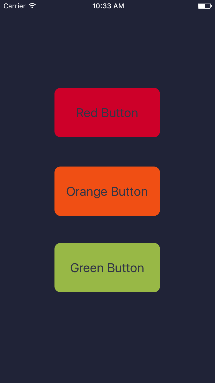
This solution is far from perfect as it is still error prone, mistyping the color name can easily be missed and the compiler won’t be able to assist us there. Nevertheless it can help us get the most out of Storyboards, here’s the final outcome once we style all our buttons and our main view.
This really becomes powerful when you have Style structures to describe several styling properties together, for example:
struct LabelStyle {
    var color: UIColor
    var font: UIFont
}

struct LabelStyles {
    let title = Style(color: Theme.palette.darkBlue, font: UIFont.preferredFont(forTextStyle: .title1))
    let subtitle = Style(color: Theme.palette.darkBlue, font: UIFont.preferredFont(forTextStyle: .title3))
    ...
}

extension LabelStyles: StringConvertibleMembers {

}
@IBDesignable
class StyledLabel: UILabel {
var style: LabelStyle? {
didSet {
updateStyle()
}
}
@IBInspectable var styleName: String? {
didSet {
style = styleName.flatMap{ Theme.styles.member(from: $0) }
}
}
func updateStyle() {
if let style = style {
font = style.font
textColor = style.color
}
}
}Happy Styling!